Branding & Identity
Design Systems
A scale-up with a web app, marketing site, and mobile app needed a shared design system to speed development and keep UX consistent.
Typography, color, spacing, and component libraries for consistent digital and print.
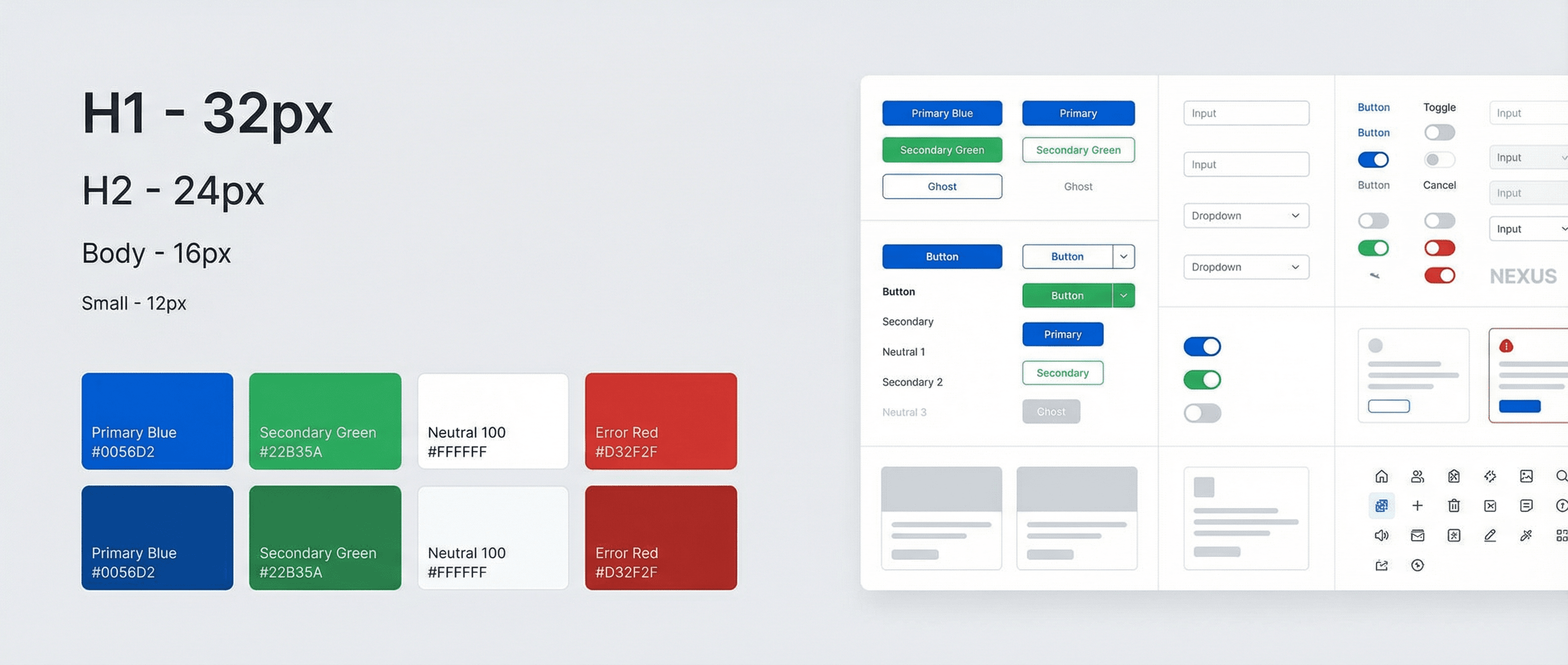
Design and engineering were working from ad-hoc components and different design tools; new features took longer than necessary and visual drift was obvious. We built a design system: tokens for colour, type, spacing, and radius; a component library (buttons, forms, cards, navigation) with variants and usage notes; and documentation in Storybook with code and design links. We aligned the system with their existing brand identity and ran a pilot on one product area before rolling out.
Adoption is now standard for new features; design–dev handoff time dropped by roughly 40%, and they’ve reduced duplicate components by consolidating on the library.
Key Outcomes
- ·Design system with tokens and component library in Storybook
- ·~40% reduction in design–dev handoff time
- ·Fewer duplicate components and more consistent UX