Branding & Identity
Unified Design System for SaaS Platform
Project Name: CloudMetric | Industry: B2B SaaS – Data Analytics Platform | Service Category: Branding Solutions – Design Systems Development
CloudMetric needed one design system across web, product, and marketing. We built a token-based system with component library, Figma-dev sync, and brand integration.
Project Overview
CloudMetric is a data analytics SaaS platform serving mid-sized enterprises across Europe. As the product scaled, multiple teams were designing landing pages, dashboards, sales decks, and marketing assets independently. The result? Inconsistent UI components, mixed typography styles, fragmented branding, and slow product releases.
Our role was to build a scalable design system that unified brand identity, product UI, and marketing assets under one structured framework.
Business Challenge
Rapid growth created design chaos:
- •Different button styles across web and product
- •Inconsistent spacing and layout patterns
- •No centralized component library
- •Slower product development cycles
- •Brand dilution across channels
The company needed a structured, reusable design system to ensure consistency, efficiency, and scalability.
Design System Strategy
1. Brand & Interface Audit
We began with a deep audit of:
- •Website pages
- •Product dashboard UI
- •Sales presentations
- •Social media creatives
- •Email templates
This allowed us to identify repeated inconsistencies and common design patterns worth standardizing.
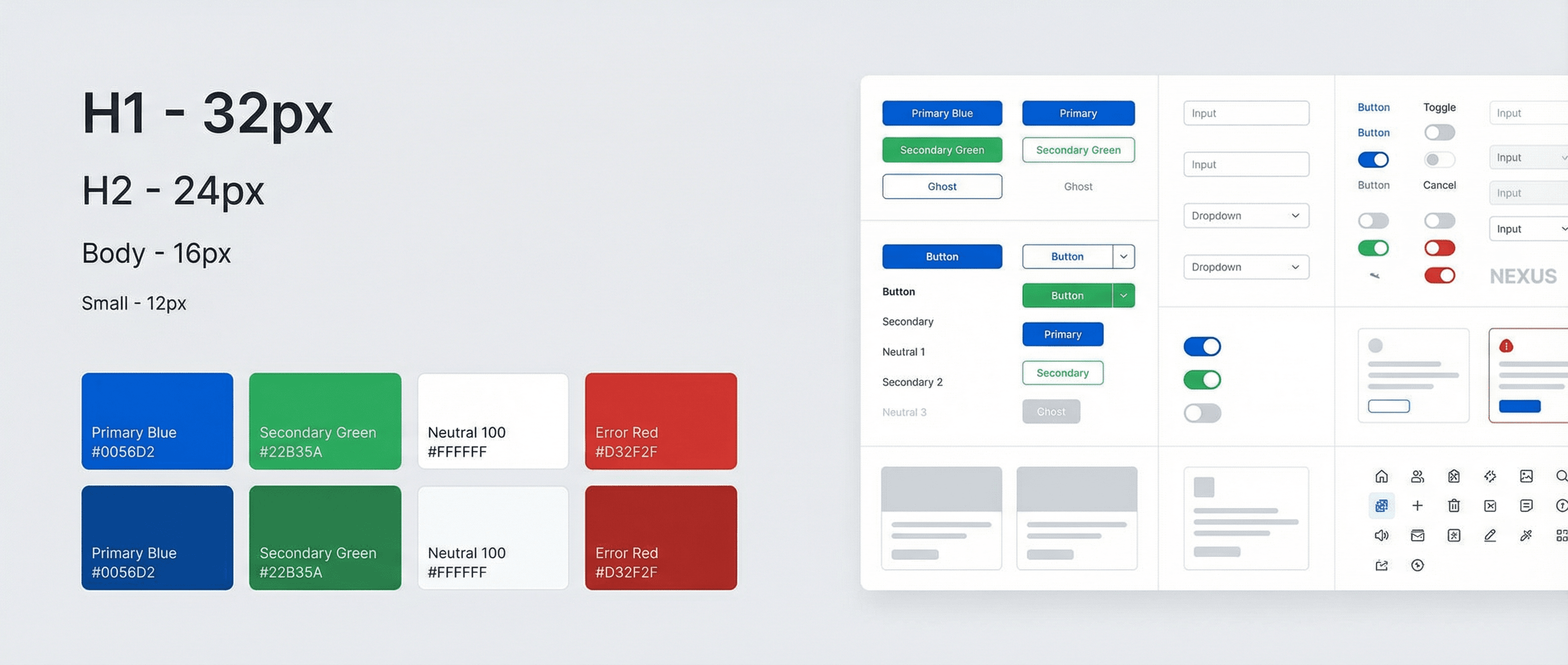
2. Core Design Foundations
We established the core building blocks of the design system:
Color Framework:
- •Primary brand colors
- •Functional UI colors (success, warning, error)
- •Neutral background scales
- •Accessibility-compliant contrast ratios
Typography System:
- •Defined heading hierarchy
- •Body text standards
- •UI label specifications
- •Responsive text scaling
Spacing & Layout Grid:
- •8px grid system
- •Defined margin and padding rules
- •Responsive breakpoints
This created a structured visual foundation.
3. Component Library Creation
We built a reusable UI component library including:
- •Buttons (primary, secondary, ghost)
- •Form fields and input states
- •Navigation menus
- •Cards and data panels
- •Modal windows
- •Notification banners
- •Dashboard widgets
Each component included usage guidelines and behavior rules. The system was built in Figma and mirrored for development in a coded component framework.
4. Token-Based Design Structure
To ensure long-term scalability, we implemented:
- •Design tokens for colors, spacing, typography
- •Shared variables between design and development
- •Version control structure
- •Documentation hub for internal teams
This reduced friction between design and engineering teams.
5. Brand Integration
Unlike a purely technical UI kit, this design system integrated branding principles:
- •Tone of voice guidance for UI microcopy
- •Icon style consistency
- •Image treatment rules
- •Illustration direction
This ensured brand identity remained consistent across product and marketing touchpoints.
Implementation Impact
The new design system was implemented across:
- •Product dashboard redesign
- •Marketing website refresh
- •Investor presentations
- •Customer onboarding flows
- •Email campaign templates
All teams adopted the same system, creating visual and functional harmony.
Measurable Results
Within six months:
- •38% faster feature release cycles
- •25% reduction in design revisions
- •Improved cross-team collaboration
- •Stronger brand consistency across channels
- •Increased customer trust due to polished user experience
Why Design Systems Matter in Branding Solutions
A strong design system:
- •Ensures brand consistency at scale
- •Speeds up product development
- •Reduces design debt
- •Improves collaboration between teams
- •Supports long-term digital growth
Design systems are not just UI toolkits. They are structured frameworks that connect brand strategy, visual identity, and product experience into one scalable ecosystem.
Key Outcomes
- ·38% faster feature release cycles
- ·25% reduction in design revisions
- ·Improved cross-team collaboration
- ·Stronger brand consistency across channels
- ·Increased customer trust due to polished UX