Branding & Identity
Visual Identity
A fintech startup that had grown through acquisition needed one coherent visual identity across four merged brands and all touchpoints.
Logo systems, mark variations, and visual language that scales across touchpoints.
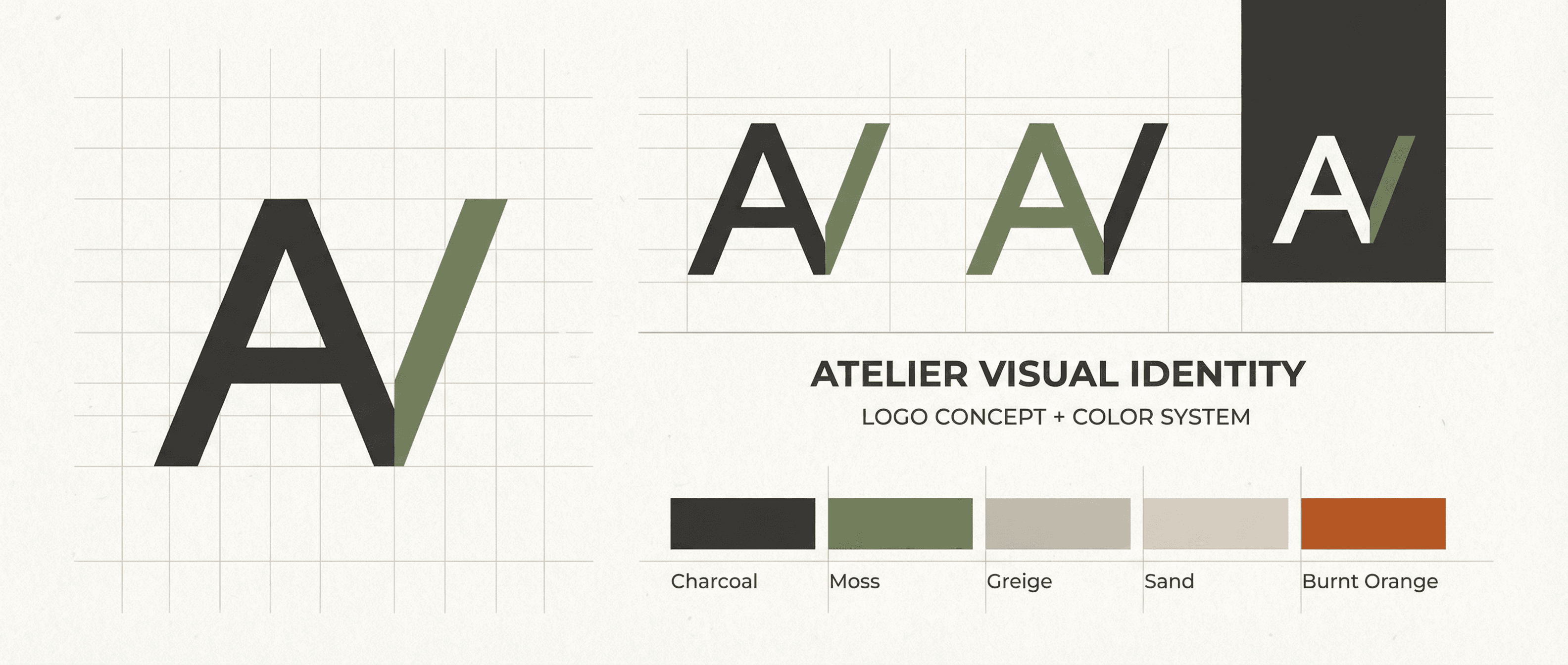
Logos, colours, and typography were inconsistent; customers and partners were confused about “who” they were. We created a unified identity: a new master logo with clear lockups and exclusion zones, a primary and secondary palette with accessibility checks, and type hierarchy for product, marketing, and legal/compliance. We also defined rules for legacy sub-brands during the transition period (e.g. “Powered by X” treatments) and produced guidelines and templates for internal and agency use.
The new identity launched in Q1; by Q3 all customer-facing digital properties and key collateral had been updated. Brand tracking showed a clear improvement in “modern and trustworthy” and a drop in “confusing or inconsistent.”
Key Outcomes
- ·Single visual identity across four merged brands
- ·All key touchpoints updated by Q3 post-launch
- ·Improvement in “modern and trustworthy” in brand tracking